How to design a product you understand nothing about
Here's my journey, where I learnt how to navigate an environment I didn’t fully understand (then) and how I stopped freaking out about it over the years.

2023 marks the year when Xavier Niel, the Iliad Group, and Scaleway announced a considerable investment in AI. This major technological shift was set to irreversibly change cloud consumption habits in the market.
It was time to rethink our brand to align with this new ambition.
The timing was also perfect with the growing momentum around AI, and the major shift this new technology was bringing to the sector. This momentum would culminate at ai-PULSE, which was set to gather the domain's leaders in Paris that November.
It was really challenging; but we did it! And we are excited to share this journey with you today. Brace yourself!
After the initial excitement of the announcement, one thing became clear: our existing brand seemed disconnected from our new goals and the expansion of our audience.
The lone developer behind their code screen was no longer our sole focus. We now had to captivate larger enterprises across many new sectors, or cutting-edge startups focused on AI, with high expectations for sophistication and professionalism.
Today, our offering revolutionizes cloud architectures, bringing innovation and performance to an unprecedented level, including AI-driven solutions.
We knew that to embody this true technological turning point, it was necessary to initiate a graphical shift.
However, the main challenge was that our rebranding initiative wasn't just about changing our main assets and calling it a day. It involved updating a huge entire system and visual language that serves as the foundation across thousands of assets for all our Scalers. This required careful planning for long-term updates, ensuring seamless operational continuity amidst our rapid company growth.
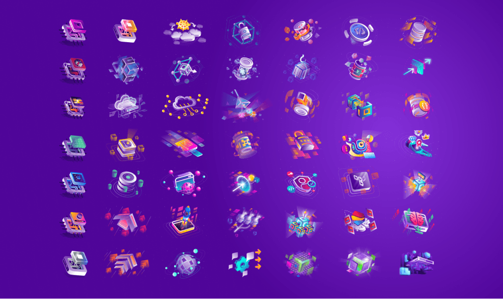
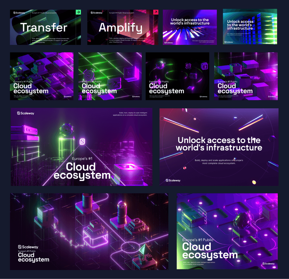
And as a concrete example, consider our extensive catalog of products, each accompanied by its own illustration. We needed to update and continuously create these numerous product illustrations in a consistent style. This ongoing task, among many others, was essential to maintain a cohesive visual identity that resonated with our evolving brand story.
While rethinking all our existing assets, we also needed to ensure that our new brand could scale smoothly with our rapidly growing product offer.
Beyond our transformation, it was essential to preserve our brand DNA. We wanted to remain recognizable, clearly delineate the visual evolution, and retain what appealed to our users:
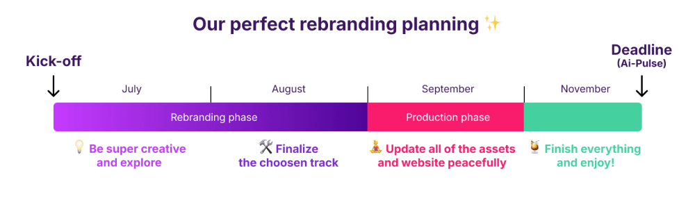
Last but not least… We began this project in June 2023, and had only three months to change everything. Everything had to be ready by early November to launch our new brand at ai-PULSE, the flagship event on artificial intelligence in Europe that we are organizing. We were in the starting blocks!
To assist us in this mission, we decided to work with exceptional talents: Anne Thai, a talented artistic director, and Romain Briaux (founder of Hervé Studio. Two experts with advanced 3D skills and extensive experience in branding and visual storytelling. With their expertise and our vision, we had everything we needed to create a strong new image for Scaleway.
We sought something entirely new, free from creative constraints, for the initial spark.
The first benchmarks were promising, featuring strong visual storytelling but with a subtle and elegant expression around the theme of space:
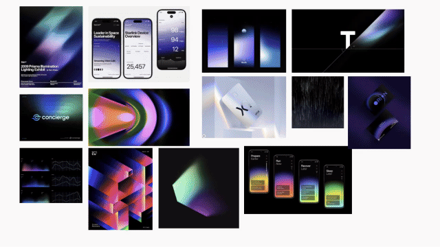
The 3D approach introduced a sophisticated aesthetic to our brand perception. It perfectly fulfilled our desire for a distinctive identity while aligning with industry trends, and the initial creative directions truly captivated us.
Although we liked all the approaches, some were too abstract and minimalist, which created too radical a break from the existing brand.
We gathered feedback from our best user advocates, the product managers, and product marketing managers. Their involvement at this stage was important to truly embrace the change, and spread it both internally and externally.
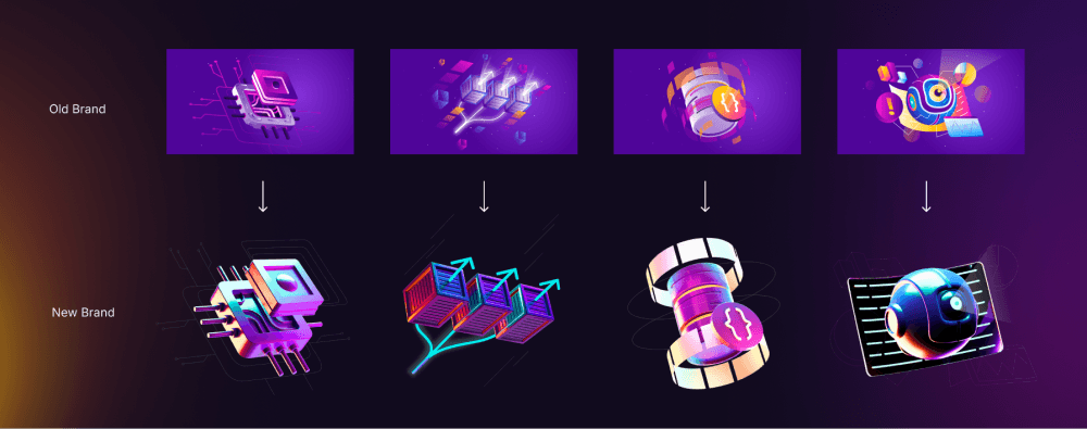
It took a few adjustments to achieve a rendering that marked a true departure from the old style without deviating too much from the original visuals. We aimed to avoid causing confusion among our audience.
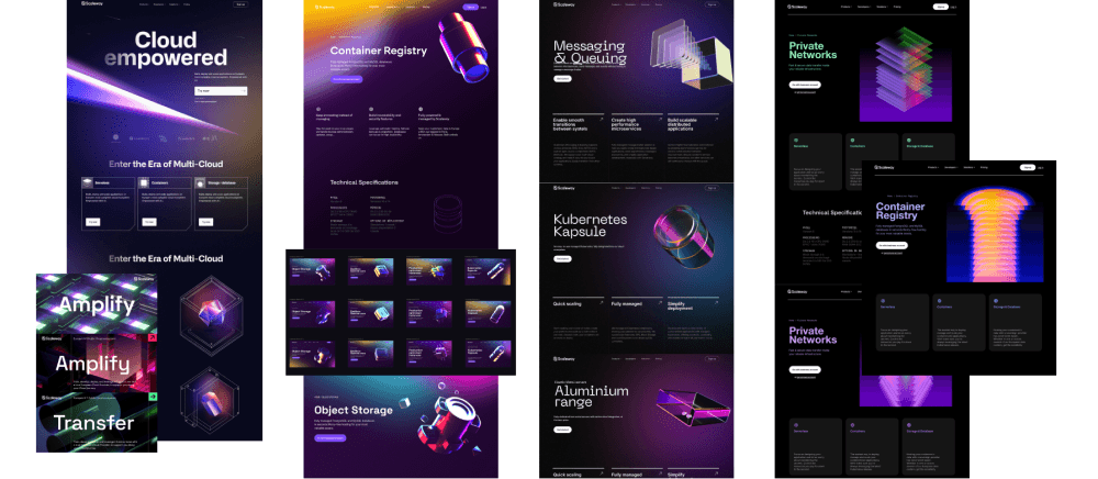
To find the right balance, we chose an approach inspired by the shapes of our current products, but with a very different graphical treatment.
Just as the sun illuminates the planets, our 3D product illustrations are lit by their environment. When you rotate them 360 degrees, the lighting changes, mimicking the sun's movement around the Earth.
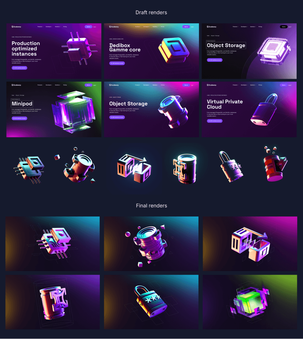
Each of the 50 visuals required special attention to perfectly align with the new brand aesthetic. Our goal was to change the perception of our offering with these new, more understated, less colorful, and less cluttered renderings.
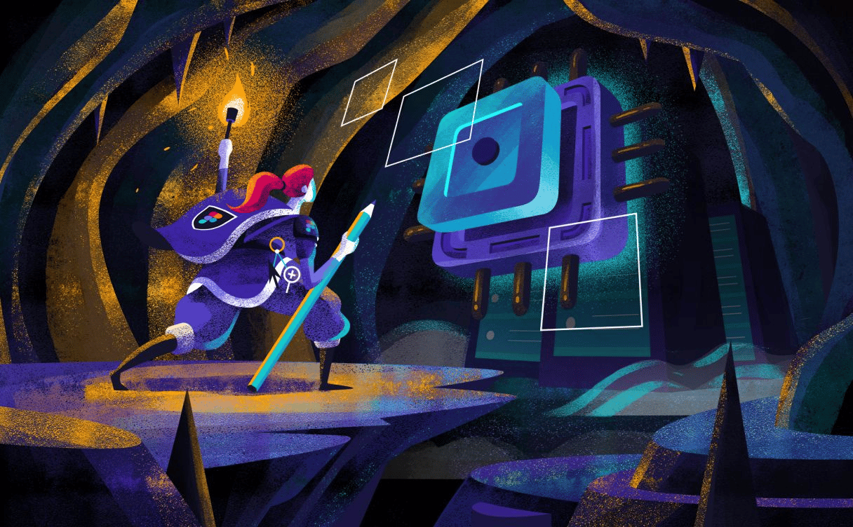
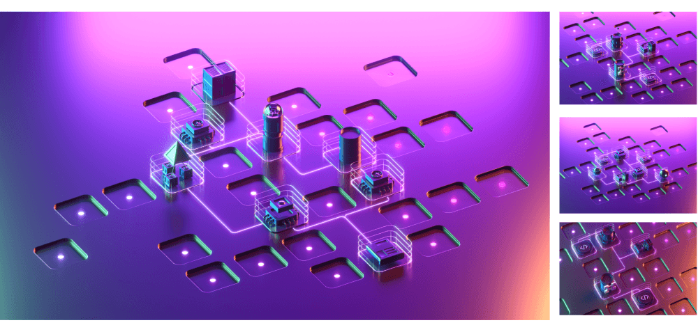
In parallel with these product visuals, which hold a central place in our brand, we collaborated with Anne and Romain to create a generic and central Key Visual that represents the essence of our offering. Our objective was to convey the idea of a complete, modular, interconnected ecosystem that reflects the power of our infrastructures.
Creatively, this challenge was not easy to meet. We explored various visual renderings, playing with abstraction, movement, light effects, as well as notions of space and floating, while integrating our product visuals.
We ultimately opted for the concept of interconnected platforms with an isometric perspective. The metallic texture of the background allowed for the reflection of off-screen lights, which we also incorporated into our product visuals, ensuring perfect coherence with our new graphic approach.
This visual was modular: by changing the displayed products, it perfectly illustrated the idea of a customizable cloud infrastructure, tailored to the specific needs of our clients.
This visual served as the basis for the introductory video presenting our new offering. Created by Hervé Studio, it announced our new positioning and unveiled our new identity. This element represented the culmination of all our creative work, encapsulated in a powerful and engaging narrative.
The result is stunning - a big shoutout to Hervé Studio for their amazing work!
We were more than satisfied with the outcome!
Now that our new visual identity was defined, it was time to integrate this new brand internally and update the numerous assets and layouts that would support it.
Stay tuned for part 2 to discover the rest of this adventure!
Here's my journey, where I learnt how to navigate an environment I didn’t fully understand (then) and how I stopped freaking out about it over the years.
Creating design approaches for high-tech products is an exciting daily challenge. Learn how we succeed to create a library of robust design assets for our cloud products ecosystem.