
How we rebranded Scaleway in three months, navigating uncharted territories ✨ Part 1
The onset of major cloud industry changes, including the arrival of AI, drove our Design team to rebrand Scaleway in just three months. How? Find out here!
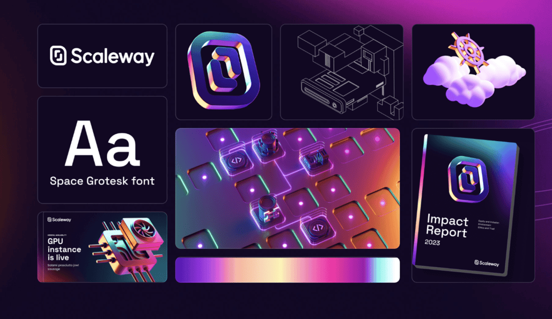
Learn how Scaleway rebranded its entire visual identity in just three months. This article, part 2 of a series (part 1 is here), delves into the strategies, tools, and creative decisions that shaped our new brand, perfectly aligned with our focus on AI and cloud services. Explore our challenges, innovative solutions, and the lessons learned along the way.
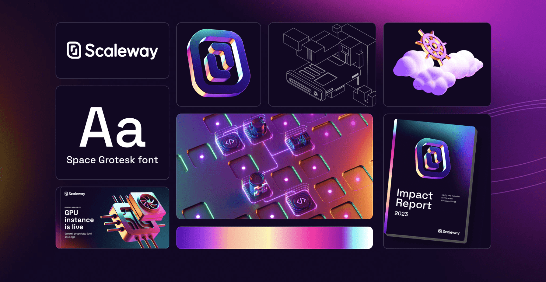
The first crucial step in adopting this new visual approach internally was to establish clear rules that would streamline and standardize our new amazing visual identity.
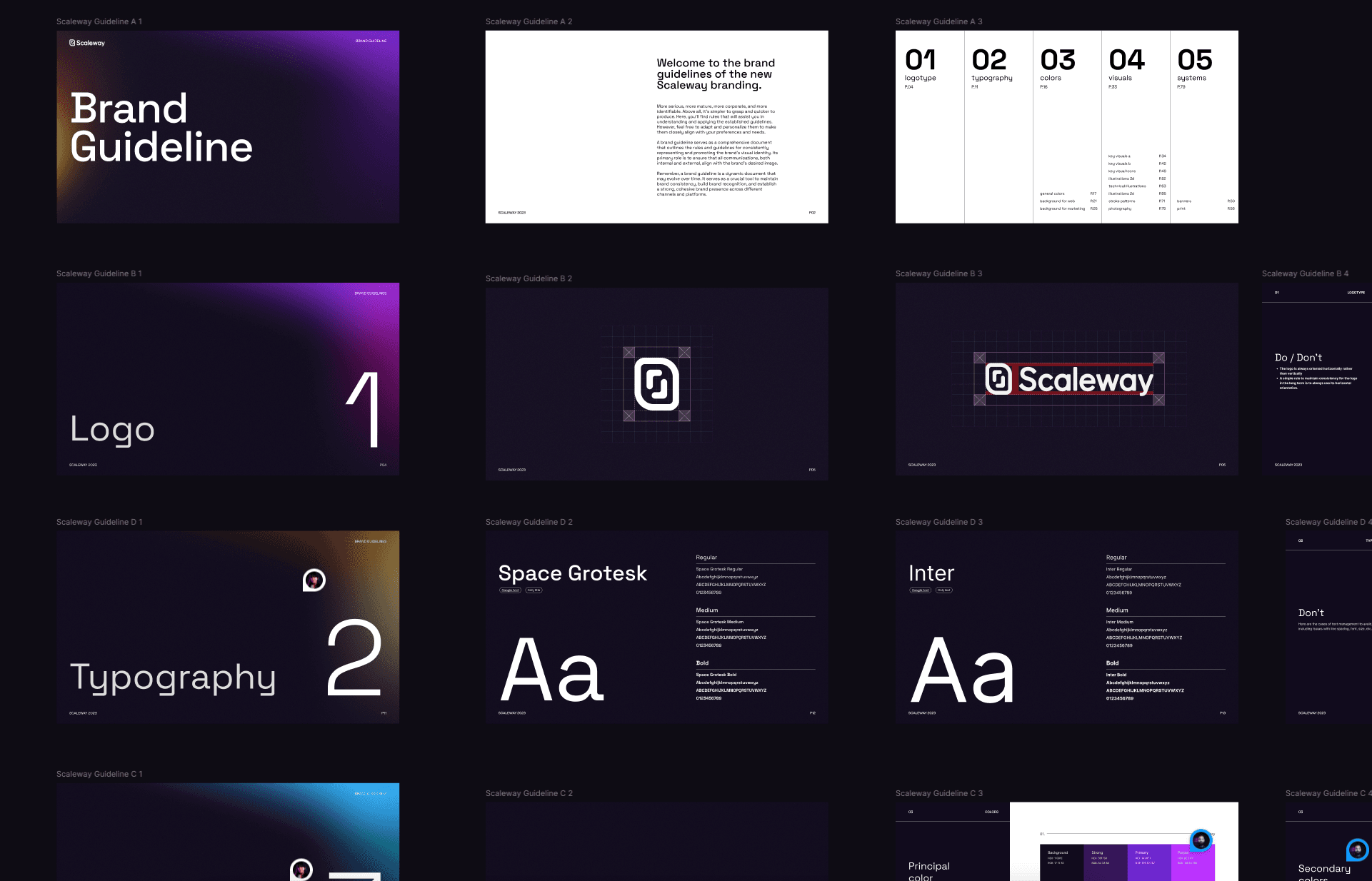
Creating a comprehensive new style guide was absolutely crucial. This guide became our ultimate blueprint for assembling the 'visual building blocks' of our brand, meticulously detailing how each element should be utilized and the exact composition rules to follow. By deconstructing the visual identity into clear, manageable components, we not only streamlined the design process but also forged an unbreakable standard of consistency across every piece of brand material.
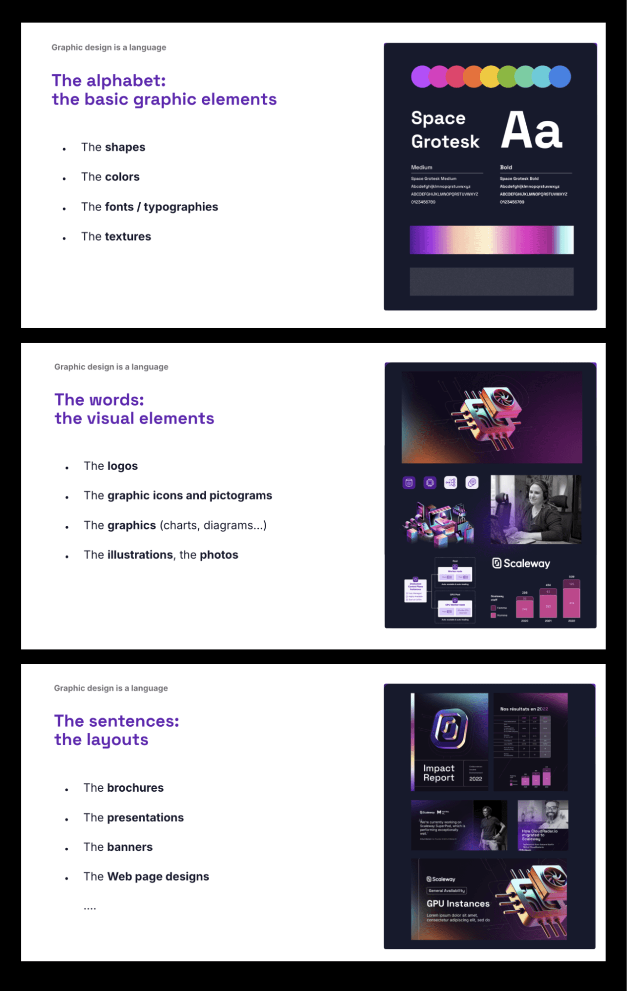
To ensure it was always accessible internally and externally, **we deployed this charter on Ultraviolet, Scaleway's design system platform.**This platform provides a centralized location where the charter can be easily accessed, updated, and referenced, ensuring that everyone involved in the design process can adhere to the established standards.
With these clear visual guidelines and actionable resources easily accessible, we empower our designers to focus on strategic initiatives and innovation, while also enabling other team members and partners to work autonomously within the defined framework.
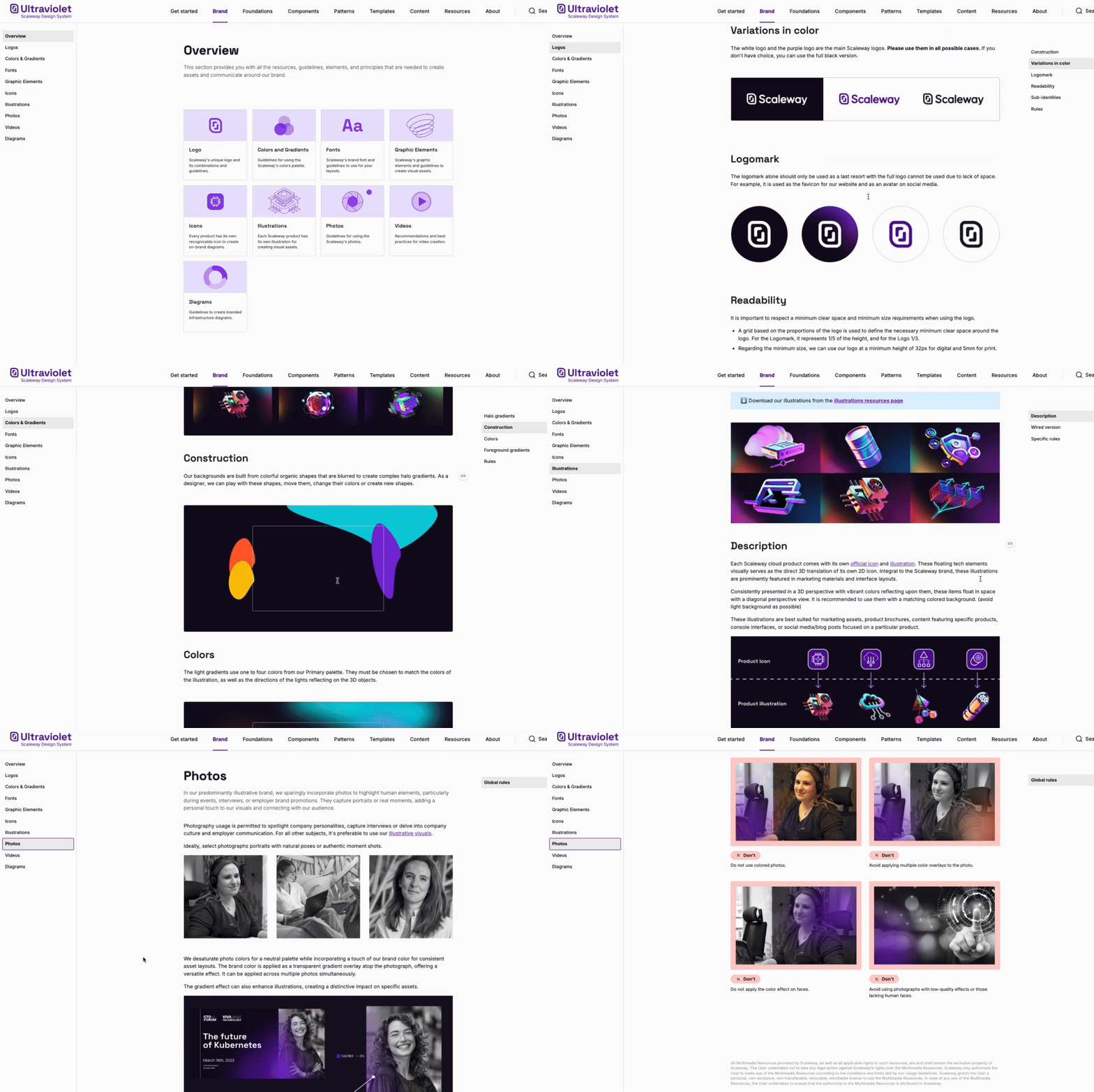
Once the rules were established and communicated, the next step was to update all visual touchpoints that could impact users. It was crucial to avoid mixing two style guides (the old and the new) to maintain a consistent user experience. However, the list of assets to update was long, and time was limited!
To address this challenge efficiently, we opted to leverage the power of templates designed in Figma. Figma was chosen as it offers a user-friendly interface that allows our marketing and communication team members—who may not have a deep design background—to make simple yet effective changes to visuals.
Each layer and element was specifically named to clearly indicate which ones should be updated and which ones should be retained within the template file, making it easy for non-designers to create stunning graphic assets:
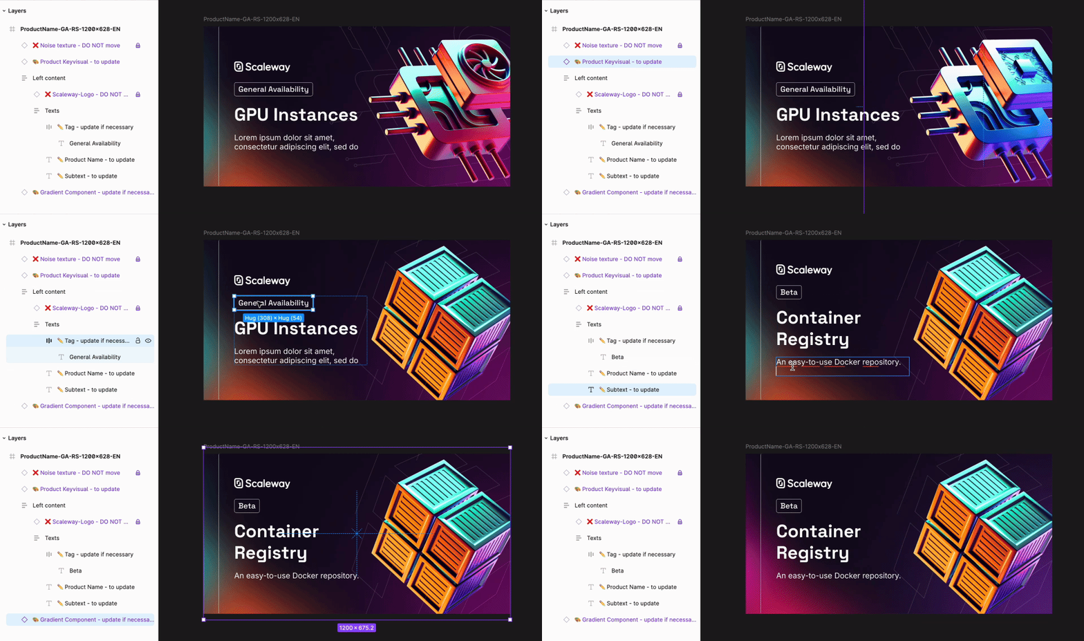
This approach of internal operational outsourcing not only streamlined the process but also allowed our design team to focus on more fundamental and strategic changes. It reduced the burden on our core design team, enabling them to concentrate on high-impact tasks while ensuring that all visual touchpoints were updated in a timely manner.
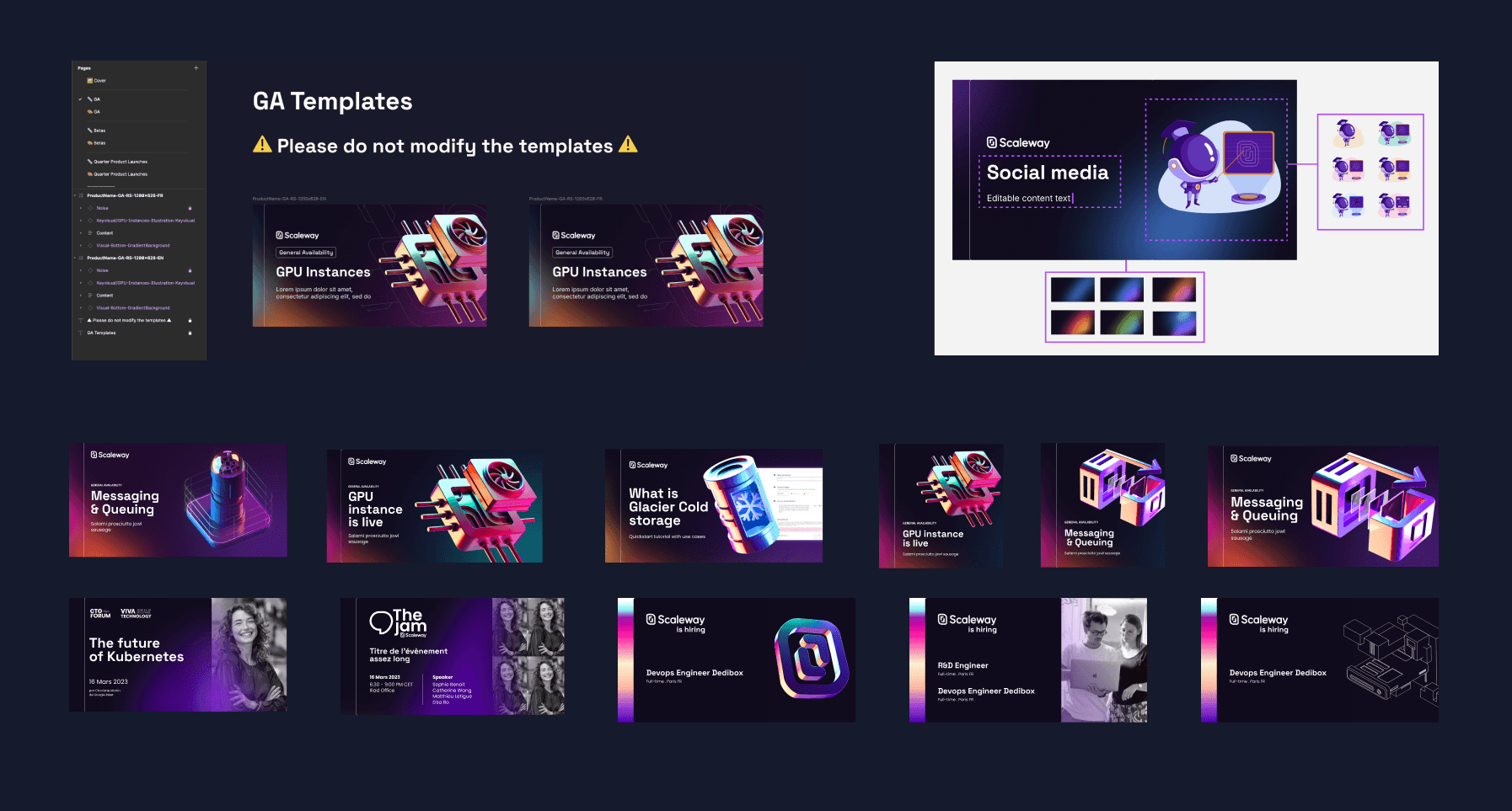
This also freed up valuable time for the visual design team to focus on the first edition of ai-PULSE, Scaleway’s first big AI conference, which was being organized for November 2023, concurrently with this rebranding effort.
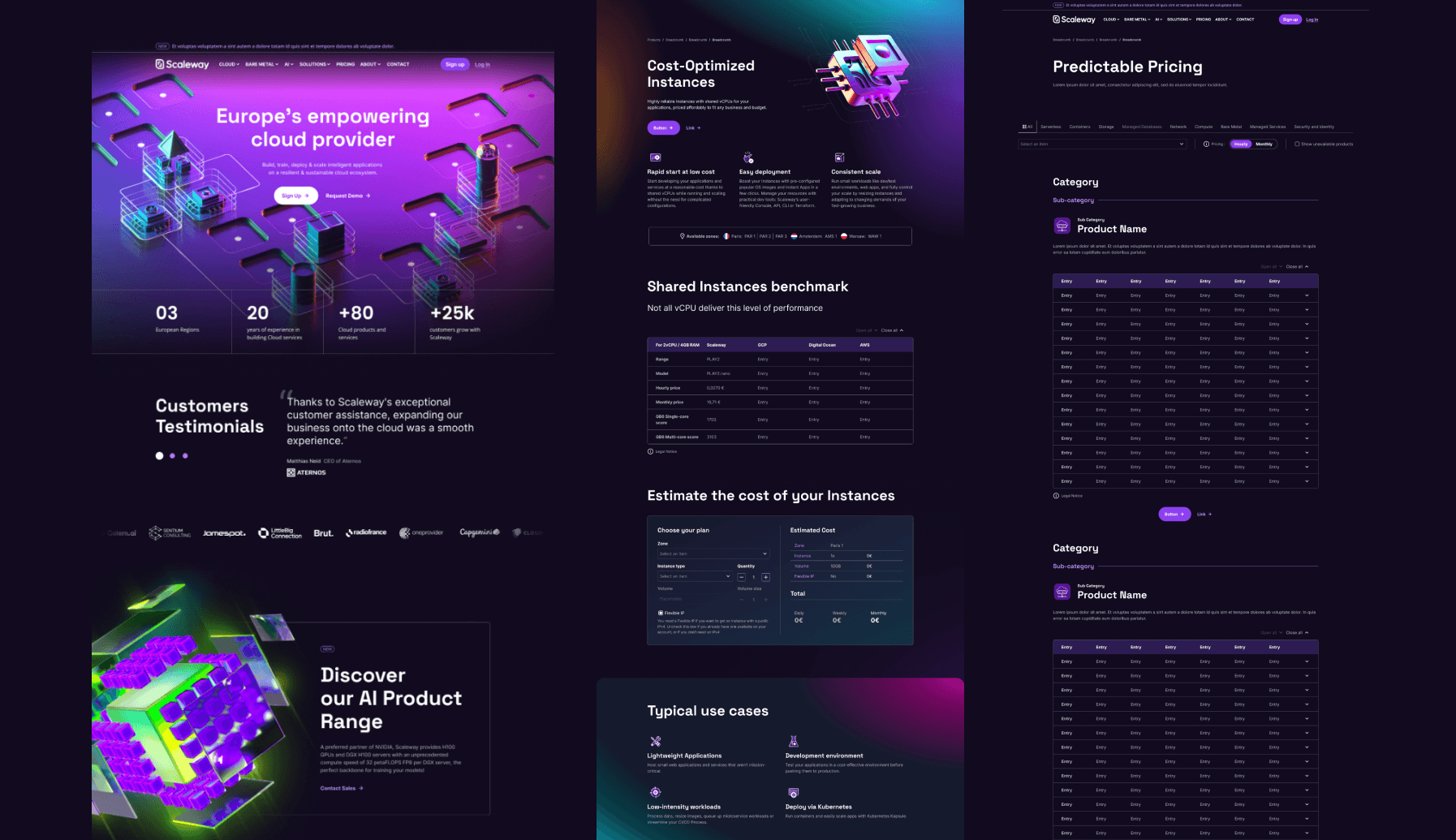
One of the central challenges in revolutionizing our brand was the redesign of our main website. Built on the Strapi CMS, our task was to retain the existing structure of the components while updating the UI aspect. We focused on refining the aesthetic elements and typographic choices to align with our new brand identity, resulting in a refreshed interface that stays true to the original framework.
Another major technical challenge was integrating 3D into the production of our product visuals internally. Our in-house illustration designer had to undergo several months of self-training, replicating existing 3D visuals to master the techniques.
This process was not without its difficulties. We had to adapt our initial product visual creation method. The process with the product teams begins with validating a product icon, followed by sketching, 3D modeling, lighting, texturing, and post-production, all aligned with the brand’s graphic charter. Each step involves iterations and stakeholder approval before the final visuals are used for social media and advertising.
Through this process, we were able to update our dozens of product visuals and integrate the creation of stunning 3D illustrations into our workflow, adapting our style to the new graphic charter.
Taking on our rebranding with new methods and resources was a big change, full of challenges and surprises. Here are the lessons we learned:
Confronted with the formidable challenge of mastering 3D skills beyond our internal capabilities, we boldly turned to external experts and fresh perspectives, launching dedicated training sessions for our illustrator. This infusion of new expertise not only accelerated our learning curve but also invigorated our approach, highlighting the crucial role of external insights in driving innovative solutions.
Underestimating the time required for creative exploration and 3D production, coupled with summer breaks and conflicts with the ai-PULSE branding, led to significant delays and some initial panic.
By August, it became clear we needed to shift our approach. We responded by compiling a detailed list of tasks and assets, estimating the time required for each and incorporating a 1.5x buffer for a more realistic timeline. This recalibration, along with regular schedule updates and additional resource allocation, enabled us to regain control and stay on track for the launch.
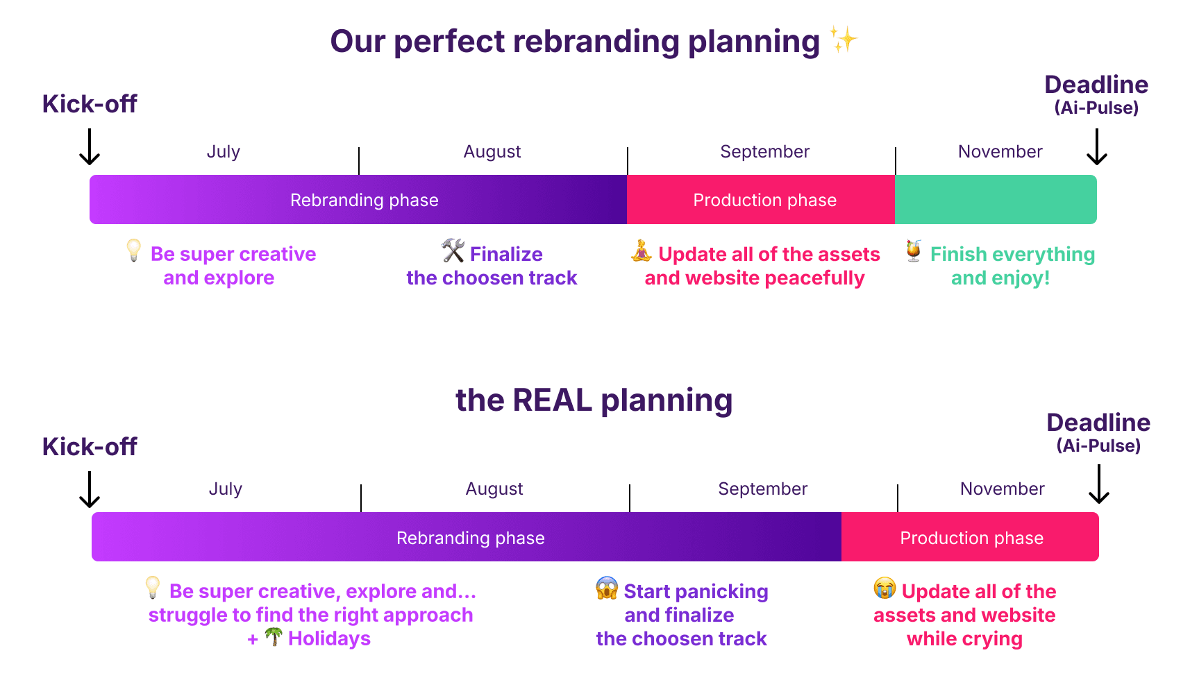
The transition to 3D proved more complex than anticipated for our team, and the initial software was unstable. To enhance production, we didn’t hesitate to switch from C4D to Blender, which significantly improved stability and rendering efficiency.
Implementing a new style guide across the company initially led to inconsistencies in visual assets. To address this, we established a detailed review process on Slack, creating a dedicated channel where every team submitted their visual assets for evaluation. This channel allowed us to review and approve assets, ensure adherence to the style guide, and maintain a cohesive brand identity.
Reflecting on our rebranding odyssey, we overcame significant obstacles and embraced unexpected challenges, forging a new visual identity that showcases our resilience and creativity.
By addressing our 3D skills gap, recalibrating our timelines, and decisively updating our tools and methodologies, we created a brand that aligns with our strategic vision and paves the way for a dynamic future.
For those undertaking a similar transformation, we advocate for the boldness to retool, revise plans, and refine processes as key ingredients for genuine success. Embrace adaptability and innovation, and consider the scalability of your brand from the start.
Recognizing that these adjustments are vital for achieving a brand that not only stands out but also grows and endures will set you on the path to long-term success. And remember, every challenge is just an opportunity in disguise—enjoy the ride and celebrate the wins along the way! 🚀🎉

The onset of major cloud industry changes, including the arrival of AI, drove our Design team to rebrand Scaleway in just three months. How? Find out here!
Here's my journey, where I learnt how to navigate an environment I didn’t fully understand (then) and how I stopped freaking out about it over the years.
Creating design approaches for high-tech products is an exciting daily challenge. Learn how we succeed to create a library of robust design assets for our cloud products ecosystem.