Creating a documentation website using Object Storage bucket website and Material for MkDocs
This tutorial shows you how to create a documentation website using the Scaleway Object Storage bucket website feature with MkDocs.
MkDocs is a static site generator that allows users to generate a static website from a set of Markdown files. It is written in Python and uses Markdown for content creation. We will use MkDocs to generate our website, and Material for MkDocs which is a documentation framework that extends MkDocs with additional features and customization options, to create visually appealing and user-friendly documentation websites.
You will learn to set up MkDocs and configure, preview, and deploy your website.
Before you start
To complete the actions presented below, you must have:
- A Scaleway account logged into the console
- Owner status or IAM permissions allowing you to perform actions in the intended Organization
- Installed Python
- Installed pip
- Installed Visual Studio Code
- Knowledge of the markdown markup language
Set up MkDocs and configure your website
Setting up MkDocs
-
Open the Visual Studio Code terminal and paste the following command to create a virtual environment to host your MkDocs content:
python -m venv envname -
Activate the virtual environment:
source envname/bin/activate -
Create a folder inside your virtual environment. This folder will contain your documentation directory.
mkdir my-folder -
Install MkDocs and the MkDocs Material theme in your virtual environment:
pip install mkdocs pip install mkdocs-material -
Open the documentation folder you have created and enter the following command:
mkdocs new .
The architecture of your folder should look like the following:
my-folder
  ├─ docs/
  │  └─ index.md
  └─ mkdocs.yml
Configuring your website
MkDocs provides many configuration options that you can use to create a beautiful website.
Open your mkdocs.yml file. The following output should display. We will add to it as we go. Delete site_url: https://mydomain.org/mysite as you will not need it.
site_name: My documentation website
theme:
  name: material
Configuring the color palette
Material for MkDocs provides two default color schemes: default, which is the light mode, and slate which is the dark mode.
Copy and paste the following code template under theme in the mkdocs.yml file to define your website's color scheme. Feel free to replace default with slate if you want to use the dark mode scheme.
palette:
    - scheme: default
Your file configuration should look like the following.
site_name: My documentation website
  theme:
    name: material
    palette:
      - scheme: default
Configuring a primary color
You can use a specific primary color for your website's header, sidebar, and text links. Refer to the MkDocs documentationto find out which color options are available. You can also set custom colors.
Copy and paste the following code template under palette to set your primary color to black.
primary: blackConfiguring an accent color
You can use an accent color to emphasize elements such as buttons, scrollbars, and hovered links. Refer to the MkDocs documentation for a list of available colors.
Copy and paste the following code template under palette to set your accent color to orange.
accent: purpleConfiguring the color palette toggle
You can give your users the choice to read your website in dark mode or light mode using a color palette toggle. Refer to the documentation for a list of available toggle options.
Copy and paste the following code template under scheme to set a color palette toggle.
# Palette toggle for light mode
      toggle:
        icon: material/toggle-switch
        name: Switch to dark mode

    # Palette toggle for dark mode
      toggle:
        icon: material/toggle-switch-off-outline
        name: Switch to light mode
This is what your mkdocs.yml file should look like:
site_name: My documentation website
  theme:
    name: material
    palette:
      # Palette toggle for light mode
      - scheme: default
        primary: black
        # Primary defines the primary color of the theme.
        accent: purple
        # Accent specifies the accent color of the theme.
        toggle:
        # toggle specifies the icon and name for toggling between light and dark modes.
          icon: material/toggle-switch
          name: Switch to dark mode

      # Palette toggle for dark mode
      - scheme: slate
        primary: white
        # primary defines the primary color of the theme.
        accent: deep purple
        # accent specifies the accent color of the theme.
        toggle:
        # toggle specifies the icon and name for toggling between light and dark modes.
          icon: material/toggle-switch-off-outline
          name: Switch to light mode
Configuring fonts
Material for MkDocs integrates with Google Fonts but you can also add custom fonts if you prefer.
Copy and paste the following code template to use the Roboto font.
font:
    text: Roboto
Refer to the documentation to further configure your website's font styles.
Your mkdocs.yml file should look like the following:
site_name: My documentation website
  theme:
    name: material
    palette:
      # Palette toggle for light mode
      - scheme: default
        primary: black
        # Primary defines the primary color of the theme.
        accent: purple
        # Accent specifies the accent color of the theme.
        toggle:
        # toggle specifies the icon and name for toggling between light and dark modes.
          icon: material/toggle-switch
          name: Switch to dark mode

      # Palette toggle for dark mode
      - scheme: slate
        primary: white
        # primary defines the primary color of the theme.
        accent: deep purple
        # accent specifies the accent color of the theme.
        toggle:
        # toggle specifies the icon and name for toggling between light and dark modes.
          icon: material/toggle-switch-off-outline
          name: Switch to light mode
    font:
      text: Roboto
Configuring navigation
MkDocs provides multiple ways to configure your website's navigation depending on the amount of content your website contains. Find out all available configurations for navigation on the MkDocs website.
Set up the navigation structure of your website using the code sample below. This configuration allows you to organize your navigation menu as you wish.
nav:
# Defines the navigation structure of the website, linking to the corresponding markdown files.
  - Welcome to my documentation website: index.md
  - My documentation website's FAQ: faq.md
  - Understanding a concept in my documentation website: understanding-concept.md
  - How to perform action one: perform-action-one.md
  - How to perform action two: perform-action-two.md
  - How to perform action three: perform-action-three.md
Configuring admonitions
An admonition also known as a call-out, is a graphical element used in user guides. It consists of a text block used to give a description or additional information to users. You can use admonitions to add side content to your documentation or make parts you want your users to notice stand out more. Refer to the documentation to see available admonition icons.
Enabling admonitions
Copy and paste the following code template to enable admonitions, make them collapsible, and nest content inside them.
markdown_extensions:
  - admonition
  - pymdownx.details
  - pymdownx.superfences
Adding admonition icons
Copy and paste the following code template to use Octicons admonition icons. You can also use the FontAwesome admonition icons.
icon:
    admonition:
      note: octicons/tag-16
      abstract: octicons/checklist-16
      info: octicons/info-16
      tip: octicons/squirrel-16
      success: octicons/check-16
      question: octicons/question-16
      warning: octicons/alert-16
      failure: octicons/x-circle-16
      danger: octicons/zap-16
      bug: octicons/bug-16
      example: octicons/beaker-16
      quote: octicons/quote-16
Using admonitions
The example below shows you the syntax you need to use in your markdown files for admonitions. You can replace info with any of the admonitions you have added in the previous section (abstract, note, tip, success, question, warning, failure, danger, bug, example, and quote).
!!! info

    I am an information admonition. You can use me to give additional information to your user.
You can add a custom title inside the admonition box like in the example below.
!!! info "Information about the admonition box"

    I am an information admonition with a title. You can use me to give additional information to your user.
If you want your admonition box to be collapsible, you can use the code below. The user will only see the box without its content.
??? info

    I am a collapsible information admonition. You can click the arrow to the right to expand me.
Find out more about admonitions on the MkDocs website.
Adding images
You need to add the glightbox plugin in your mkdocs.yml file to add images and videos on your website. Find out how to add the plugin in the Additional configuration section below.
You can add images in your markdown files using the following example:
{align=center, width="150", loading=lazy}You can also add images inside collapsible admonitions. Notice that the image component is indented under the info text. Your image will not display if the indentation is incorrect.
??? info "Your example should look like the following"
{align=center, width="150", loading=lazy}Additional configuration
You can add the following additional configuration options in your mkdocs.yml file. The features component allows you to use various features of the Material theme.
features:
  - content.code.copy
  # Adds a copy button to code blocks.
  - navigation.sections
  # Enables section-based navigation.
  - navigation.path
  # Shows the navigation path (breadcrumbs).
  - navigation.top
  # Adds a "back to top" button.
  - search.suggest
  # Enables search suggestions.
Add the plugins component to define the MkDocs plugins you want to enable on your website. The search plugin allows you to add the search functionality and the glightbox plugin allows you to add images and videos.
plugins:
  # Lists the MkDocs plugins enabled for the site.
  - search
  # Adds search functionality.
  - glightbox
  # Adds lightbox functionality for images and videos.
Add the copyright notice for your website.
copyright: >
  Copyright © 2016 - 2024 Martin Donath
Template of the mkdocs.yaml file
If you have only added the elements shown in the sections above, you can copy the code below or use it as reference to make sure you have added everything correctly in your mkdocs.yml file.
site_name: My documentation website
theme:
  name: 'material'
  palette: # Palette toggle for light mode
    - scheme: default
      primary: black # Primary defines the primary color of the theme.
      accent: purple # Accent specifies the accent color of the theme.
      toggle: # toggle specifies the icon and name for toggling between light and dark modes.
        icon: material/toggle-switch
        name: Switch to dark mode

  # Palette toggle for dark mode
    - scheme: slate
      primary: white
      accent: deep purple
      toggle:
        icon: material/toggle-switch-off-outline
        name: Switch to light mode
  font:
        text: Roboto
  nav: # Defines the navigation structure of the website, linking to the corresponding markdown files.
    - Welcome to my documentation website: index.md
    - My documentation website's FAQ: faq.md
    - Understanding a concept in my documentation website: understanding-concept.md
    - How to perform action one: perform-action-one.md
    - How to perform action two: perform-action-two.md
    - How to perform action three: perform-action-three.md
  markdown_extensions:
    - admonition
    - pymdownx.details
    - pymdownx.superfences
  icon: # Maps custom MkDocs icons to different types of admonitions (alerts or messages), using icons from the Octicons set.
    admonition:
      note: octicons/tag-16
      abstract: octicons/checklist-16
      info: octicons/info-16
      tip: octicons/squirrel-16
      success: octicons/check-16
      question: octicons/question-16
      warning: octicons/alert-16
      failure: octicons/x-circle-16
      danger: octicons/zap-16
      bug: octicons/bug-16
      example: octicons/beaker-16
      quote: octicons/quote-16
  features:
    - content.code.copy # Adds a copy button to code blocks.
    - navigation.sections # Enables section-based navigation.
    - navigation.path # Shows the navigation path (breadcrumbs).
    - navigation.top # Adds a "back to top" button.
    - search.suggest # Enables search suggestions.
  plugins: # Lists the MkDocs plugins enabled for the site.
    - search # Adds search functionality.
    - glightbox # Adds lightbox functionality for images and videos.
  copyright: >
    Copyright © 2016 - 2024 Martin Donath
Preview and deploy your website
Preview your website
Once your website's content is ready and configured, you can preview it to make sure that everything displays properly.
- Open the folder containing your
docsdirectory in Visual Studio Code. The one we have created in this tutorial is namedmy-folder. - Open the Visual Studio Code terminal and paste the following command:
mkdocs serve - Copy the localhost link (
http://127.0.0.1:8000/) that displays in the output into your browser. Your website should display. - Check that everything on your website displays correctly and ensure that there are no broken links.
- Hit
ControlandCto shut down the localhost. - Run the following command in your terminal to generate your folder's content into a static website:
mkdocs build
Deploy your website
- Create an Object Storage bucket from the Scaleway console.
- Enable the bucket website feature on your bucket.
- Click your bucket, then the Bucket settings tab.
- Scroll down to the Bucket website section and enter the names of your index and error documents and save your changes. By default, your index file is named
index.html, and your error file is named404.html. - Scroll back up and click the Files tab.
- On your local computer, open the
sitefolder generated in the previous steps. - Select all the files and folders inside your
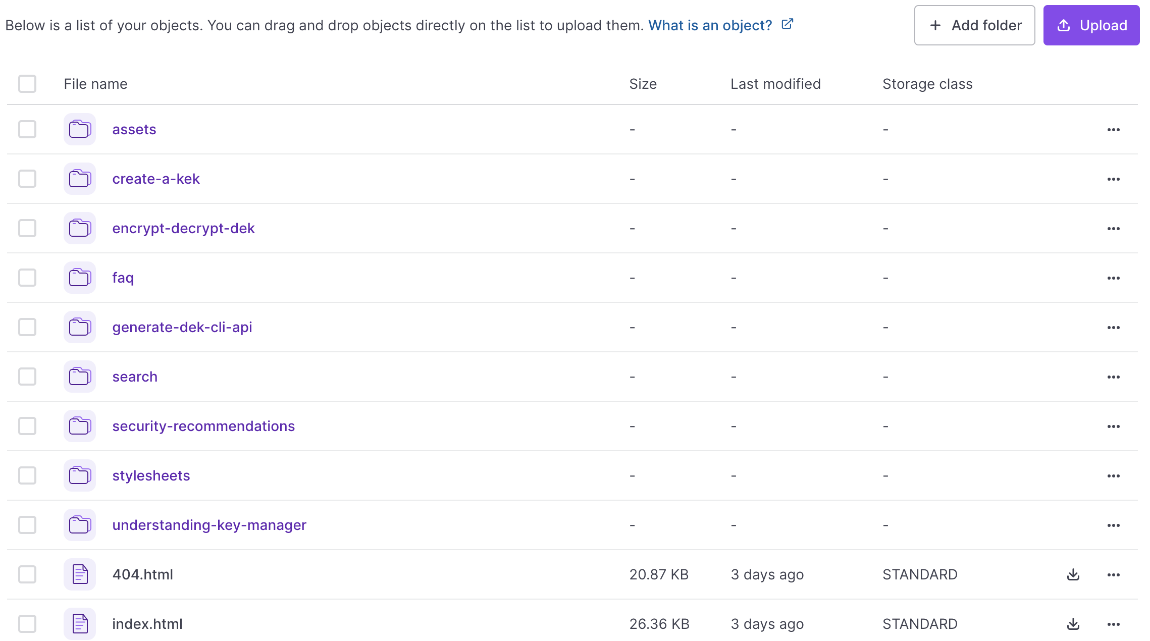
sitefolder and drag and drop them inside your bucket. - Select a storage class when prompted and click Validate storage class to confirm. Your file architecture should look like the following.
- Once the transfer of your files is complete, click the Bucket settings tab and scroll down to the Bucket website section.
- Retrieve the URL of your website under Website URL.
Example of what your website should look like
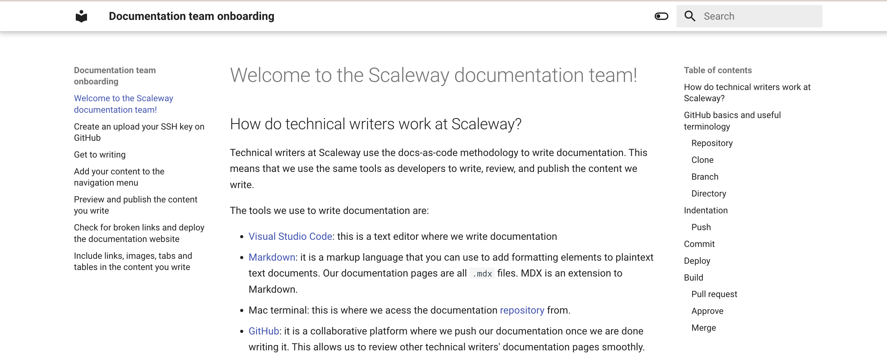
Your website's homepage should look similar to the following in light mode:
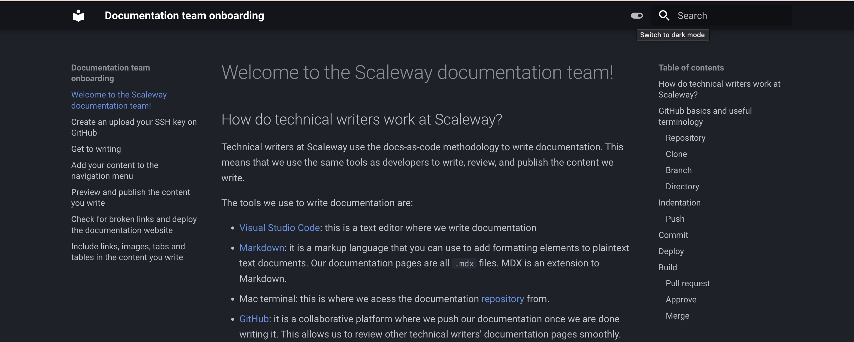
Your website's homepage should look similar to the following in dark mode:
This is what a collapsible admonition with a custom title should look like when collapsed:
This is what a collapsible admonition with a custom title should look like when expanded:
Visit our Help Center and find the answers to your most frequent questions.
Visit Help Center